






Games
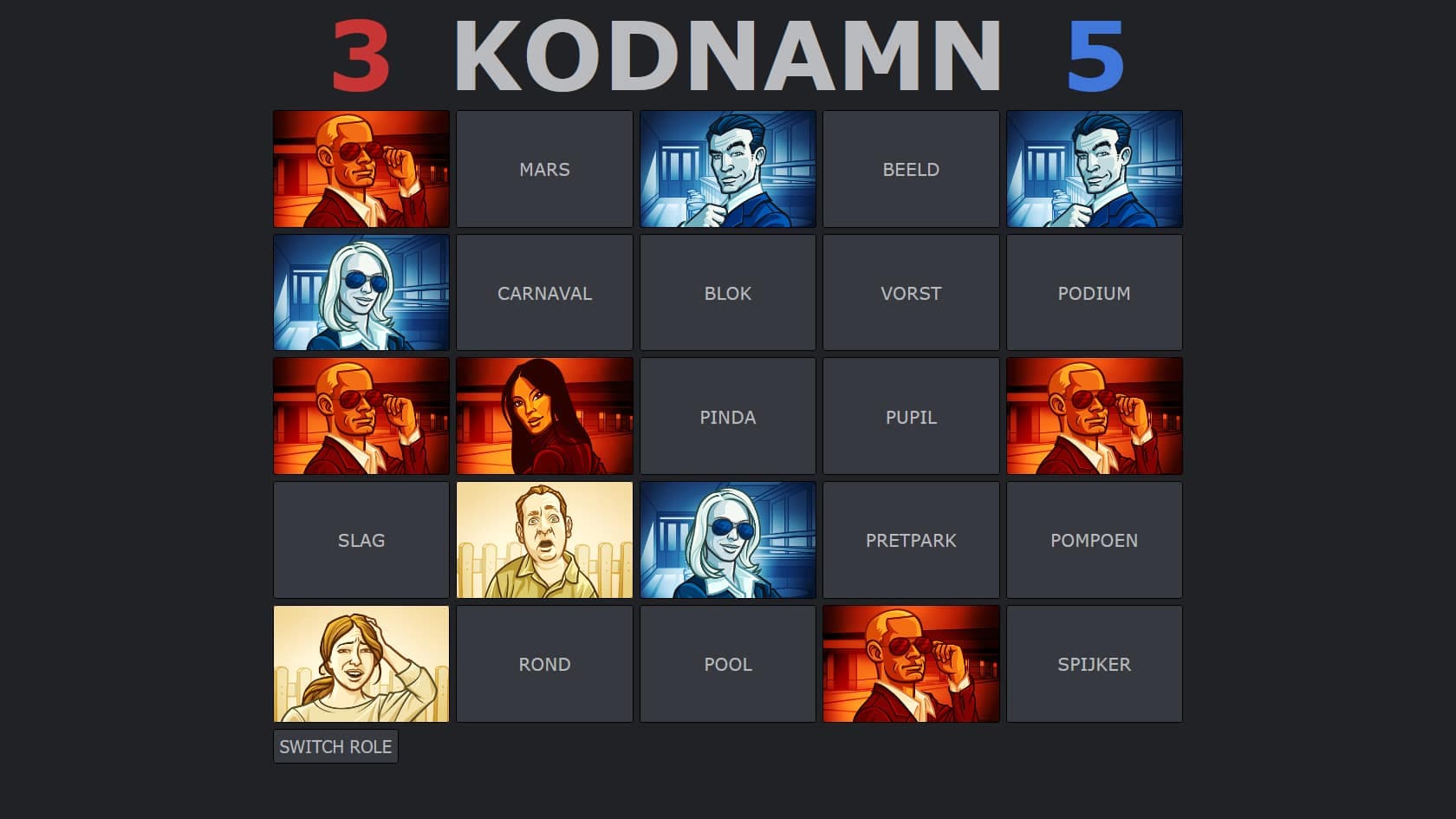
Lockdown game night saved by a homemade Codenames
With clone sites congested, Kodnamn kept every player’s board in sync through a Firebase real-time database.
Full story, page 7How everything signed Fréson is set, in both editions, with the reason for every rule.
Edited by Yannic Fréson
This is the one source of truth for the brand. The photography site and the 3D service print the Dark edition; this paper prints Newsprint. The specimens are the sites’ own components, set from the same code, so what you see here is what ships. Switch editions below to print the shared specimens the other way; the ones that belong to one edition stay in it.
Specimens printed in
Page 2, The mark
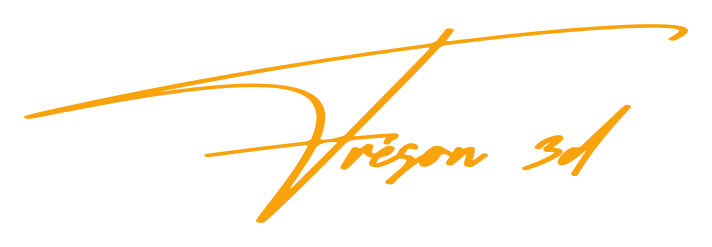
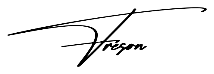
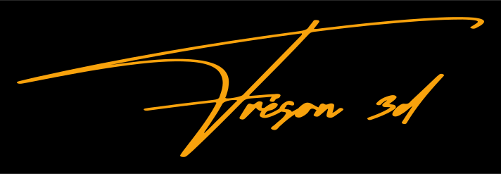
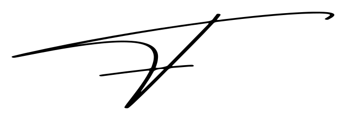
Fréson is a signature, set in Asteroid in amber and squashed by hand. The first letter is a long, low swoosh; the rest is stretched a tenth wider and pressed to six tenths, tucked so the accent on the é meets the end of the crossbar.
/brand/freson-wordmark-amber.svg.narrow, 2.5rem, 3rem from 640px
Tight spots: a footer, a nav.
wide, 3.5rem, 4rem from 640px
Inside pages of the paper, back to the front.
hero, 5rem, 7rem, 9rem
A Dark site’s opening screen.
nameplate, 6rem, 9rem, 12rem, 14rem
The front page of the paper.
Use the outlined SVG, never live text.
Why It looks the same on every device, with no flash while a font loads, and matches the business cards exactly.
Keep the squash at every width. Only the size changes.
Why The squash is the signature. A mark that unsquashes on phones is a different mark.
The mark is always aria-hidden; the element around it carries the name.
Why A screen reader should say “The Fréson”, not read out a drawing.
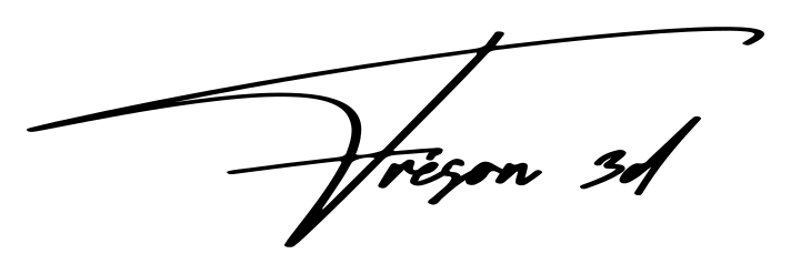
The 3D service signs with the same hand: a lowercase 3d after réson, tucked under the tail of the F.
Why One signature with the wordmark’s box, so Yannic Fréson reads first and the service second.
Never set “3D” beside the wordmark in another face.
Why Two faces side by side read as a logo lock-up, not a signature.
The monogram is the squashed F alone, for favicons and tight spaces.
Why At 16px the full signature is a smudge; the swoosh still reads.
Wordmark
3D mark
Monogram
Page 3, Colour
Three colours do all the work, in two editions. Amber is the only accent, and it is used sparingly: if everything is amber, nothing is.
21:1
#000000 on #ffffff. Every word on the paper.
10.2:1
#000000 on #f8a20c. Flags, buttons, the skip link.
2.1:1
#f8a20c on #ffffff. Never text. Amber on white is a fill only.
There are no grey tokens. Muted is ink at 60%.
Why A grey is a fourth colour. Opacity keeps the palette at three and works on both grounds.
On the paper, amber is a spot ink: a fill, never text.
Why Amber on white is 2.1:1. It can’t carry a word, so it carries flags, the nameplate and one rule.
Anything on amber is black.
Why Black on amber is 10.2:1; white on amber is 2.1:1, as unreadable as amber on white.
The focus ring is amber on Dark and black on the paper.
Why An outline has to reach 3:1 against what is around it. Amber does on black, not on white.
No second accent, no gradients.
Why The restraint is the brand. A second colour would make amber ordinary.
| Token | Newsprint | Dark | Use |
|---|---|---|---|
| bg | The page: white paper, or the black canvas. | ||
| ink | Text, rules, and on Dark the photo mats. | ||
| accent | The one colour. Dark: the wordmark, focus ring, buttons, hovers. Newsprint: a spot ink, only ever a fill. | ||
| on-accent | Anything set on an amber fill. | ||
| ink-muted | Secondary text. Ink at 60%, never a grey. | ||
| hairline | Borders and dividers. Newspaper rules print solid. | ||
| frame | The frame around every page on a mouse or trackpad screen. | ||
| focus | The 2px keyboard outline, 3px clear of the element. |
Page 4, Type
A script for the signature, a condensed display face for headlines, a news face for the paper and the system’s own sans on the Dark sites. No face does another’s job.
Asteroid, both editions
The signature, and the rare signed word: the photography site’s categories, the paper’s supplements.
Why It is the signature’s face. Used for anything else, the signature stops being special.
Balbek, both editions
A wooden PC for Wintergatan’s Martin Molin
Display. Every headline on the paper in sentence case; on Dark, capitals for titles, and capitals with wide tracking for taglines, nav and buttons.
Why Condensed and heavy, it carries a long, specific headline in two lines where a wider face needs four.
Newsreader, Newsprint
During the first lockdown I wanted a way to play Codenames with friends.
The paper’s text face: justified, hyphenated body, italic standfirsts and captions, small capitals for the edition strip, datelines and bylines.
Why Drawn for news reading, with an optical-size axis, so a 14px caption and a 24px standfirst each get a cut made for their size.
System sans, Dark
Off the clock, behind a camera and at the 3D printer.
Body copy on the Dark sites, at a measure near 65 characters.
Why On a black canvas the photos are the voice. The body text should read and step aside.
The same eye, behind every lens
Off the clock, behind a camera and at the 3D printer. The paper sets this in Newsreader; the Dark sites set it in the system’s own sans, and let the photos do the talking.
Headlines are Balbek in sentence case on the paper; capitals on Dark.
Why Sentence case reads like news. On a black canvas, short capitals sit like gallery labels.
Set a wrapping sentence-case Balbek headline at a line height of 1.05, never under 1. Capitals-only titles on Dark may close to 0.95.
Why Its descenders drop 0.2em and its ascenders rise 0.8em. Under 1, a “g” runs into the capitals below. Capitals have no descenders, so only an accented capital, at 0.97em, could touch.
The paper sets capitals only as small caps.
Why Small caps keep datelines and bylines quiet beside the headlines.
Running text keeps a measure of at most 65 characters.
Why Longer lines lose the reader on the way back to the left edge.
Keep Ü Ù Ú Û ° ² ³ out of Balbek.
Why The font has no glyphs for them; the browser would swap in another face mid-word.
| Style | Face | Size | Line height | Edition | Use |
|---|---|---|---|---|---|
| headline-lead | Balbek | Newsprint | The lead story: the biggest type on the front page. | ||
| headline-article | Balbek | Newsprint | An article’s headline. | ||
| headline | Balbek | Newsprint | Feature headlines. | ||
| headline-brief | Balbek | Newsprint | Briefs and More from this edition. | ||
| column-heading | Balbek | Newsprint | A column’s heading, on a 3px rule. | ||
| standfirst | Newsreader | Newsprint | The one sentence under a headline. | ||
| news-body | Newsreader | Newsprint | Running text on the front page, justified and hyphenated. | ||
| article-body | Newsreader | Newsprint | An article’s one column, opening with a drop cap. | ||
| caption | Newsreader | Newsprint | Under every photo: its alt text, set as a sentence. | ||
| edition-strip | Newsreader | Newsprint | The edition strip and bylines. Small capitals are the only capitals the paper sets. | ||
| kicker | Newsreader | Newsprint | A story’s section, over its headline below the lead. Datelines run at body size, in small capitals, inside the first paragraph. | ||
| display-xl | Balbek | Dark | Page and section titles on the black canvas. Capitals have no descenders, so 0.95 holds; only an accented capital under another line would touch. | ||
| body | System sans | Dark | Running text on the Dark sites. |
Page 5, The frame
A hard, square border around every page, white on the Dark sites and black on the paper. It is the most recognisable thing about the brand, and it is for mouse and trackpad screens only.
Half a rem below 640px, a full rem above.
Why The frame should read as an edge, not eat a phone-sized window.
Each side widens to clear a notch or a home indicator.
Why max(frame, safe-area inset) keeps the frame visible and the content clear of the hardware.
Touch screens get no frame.
Why Touch browsers, iOS Safari above all, move and float their toolbars over the page. No version of a frame sat right there.
Nothing is pinned to the bottom of a touch screen.
Why That is where Safari’s toolbar floats. Persistent actions live in the sticky header.
No border radius, ever.
Why The frame is square, so everything inside it is square too.
Page 6, Two editions
The same tokens print two ways. Dark is white on black with a white frame; Newsprint is the same brand in negative, black ink on white paper with a black frame. Amber stays amber in both.
Photography
Selected work
Nightlife, portraits and the outdoors, each print in its white mat.
A wooden PC for Wintergatan’s Martin Molin, designed in Belgium
Two months of weekly calls with Linus Tech Tips ended with the designers’ names etched into the case.
Pick the edition by site, not by mood.
Why The photography and 3D sites are Dark, the developer portfolio is Newsprint. A reader moving between them should feel one family.
The newspaper is played straight in its structure and lightly in its copy.
Why Real newspaper furniture makes the conceit work; jokes everywhere would make it a costume.
The sites lead to each other.
Why On Dark, doorways open the other worlds; on the paper they run as weekend supplements.
Page 7, Shape and imagery
Everything is hard-edged. On Dark, photos sit in a white mat like a framed print. On the paper they run unmatted with a caption, and rules divide the page where another site would use cards.

rule-hairline, 1px. Column rules and row dividers.
rule-heavy, 3px. Under a column’s heading.
rule-double, 7px. Under the nameplate, above the colophon: 3px, a 3px gap, 1px.
rule-spot, 8px. Amber, over In short: the one amber rule.
On Dark, every photo sits in a white mat with small, even padding.
Why It makes a screen of photos feel like prints on a wall, and keeps the photography and 3D sites consistent.
On the paper, photos run unmatted with an italic caption.
Why That is how a newspaper prints them. The caption is the photo’s alt text, set as a sentence.
Front-page photos are black and white; inside an article they run in colour.
Why Like the printed paper and its colour features.
Screenshots keep their own proportions.
Why Cropping a screenshot hides the point of it.
Rules divide; nothing floats. No cards, no shadows.
Why A newspaper separates with ink. Shadows belong to a different kind of page.
Page 8, Motion
Everything moves on one curve, fast out of the gate and slow to settle. The paper moves once: the nameplate signs itself in. After that it holds still, like paper.
Your device asks for reduced motion, so the signature stays still.
All motion waits for prefers-reduced-motion: no-preference.
Why Someone who asked for less motion sees everything at once, at rest.
Nothing starts hidden waiting for a scroll.
Why A page that reveals on scroll shows a blank to anyone who doesn’t scroll: a screenshot, a link preview, a skimmer.
One moment per page, at most.
Why A single orchestrated movement lands. Scattered effects read as noise.
Page 9, Voice
Confident, plain and specific. Short sentences, active voice, concrete nouns. A little dry wit is welcome; cleverness for its own sake is not.
A wooden PC for Wintergatan’s Martin Molin, designed in Belgium
Two months of weekly calls with Linus Tech Tips ended with the designers’ names etched into the case.
New cyclist, tired of juggling apps, builds his own
Pedal pulls rides, weight and progress into one hub, with ride badges from bronze to platinum.
Nerdland’s Discord now hands out merit badges
Members earn badges for geek-culture quests, and a bot stitches them onto a sash on command.
Nerdland’s Discord gets its own year in review
A quiet scrape of a year of messages becomes per-channel statistics and awards for the most-reacted posts.
Alarm goes off, and Spotify starts playing by itself
A phone macro wakes the PC, and a Discord bot tells Spotify to play Liked Songs through the speakers.
Write
I build interfaces that feel considered down to the last interaction.
The same IKEA desk, €240 cheaper across the border
Not
Solutions are delivered that leverage modern frameworks.
An amazing journey into the world of furniture
Headlines report: past or present tense, specific, built from facts in the project’s own write-up.
Why Never invent a fact for a better headline. A reader who catches one stops trusting the rest.
Write what someone does, not what a system delivers.
Why “I build interfaces” is a person. “Solutions are delivered” is nobody.
Curly quotes and apostrophes, everywhere.
Why Straight quotes are typewriter marks. Tests check the paper’s stories and this stylebook for them.
On the paper: no eyebrow labels, no A · B · C meta strings, no arrows on links. On Dark, one amber tagline may sit over a title.
Why The paper labels with its own furniture: flags, kickers, datelines, jump lines. The Dark sites have no such furniture, so a short tagline does the job.
Page 10, Components
These are the components the sites run on, rendered here from the same code. Each names the file it lives in.
A kicker labels; it doesn’t shout.
With clone sites congested, Kodnamn kept every player’s board in sync through a Firebase real-time database.
Full story, page 7One amber section flag per page: the lead’s on the front, the story’s on an article.
Why A flag is how the reader finds the one thing to read first. Two flags is no flag.
Below the lead, a story’s section is a kicker in small capitals.
Why It labels without competing with the lead.
Every headline links to its article, once.
Why The front page is edited: nothing appears twice.
Buttons are Dark only. The paper uses underlined links and jump lines.
Why A newspaper has no buttons. Its one button-like thing is the amber way back on a correction.
| Component | Edition | File |
|---|---|---|
| Wordmark | Both | brand/Signature.tsx |
| Frame | Both | brand/Frame.tsx, app/globals.css |
| Button | Dark | brand/Button.tsx |
| Page header | Dark | brand/PageHeader.tsx |
| Nameplate | Newsprint | components/paper/Masthead.tsx |
| Section flag and kicker | Newsprint | components/paper/Flag.tsx |
| Story: lead, feature, brief | Newsprint | components/paper/Stories.tsx |
| Article and fact file | Newsprint | components/paper/Article.tsx |
| From the editor, classifieds | Newsprint | components/paper/Columns.tsx |
| Supplements | Newsprint | components/paper/Supplements.tsx |
| Colophon | Newsprint | components/paper/Colophon.tsx |
| Correction | Newsprint | components/paper/Correction.tsx |
Back page
For machines
The same stylebook, for code and for agents: tokens.json and stylebook.md.
Changing a rule
Change it here first, with its reason. Tests hold its key values (colour, leading, the frame, the mark, the motion) to the code the site ships.
This edition
Follows its own rules: one amber flag, on the title; square corners; rules instead of boxes; every headline on the paper at 1.05.